CHIHABU
brand identity
| eat good healthy
| eat ten
| edtguide
| ezy home
E
| eat good healthy
| eat ten
| edtguide
| ezy home


WE WATCH
objective
category
This project is a collaboration between &On design studio and AGO creative agency from the United States, with AGO handling research and strategic planning and &On handling holistic branding design for We Watch.
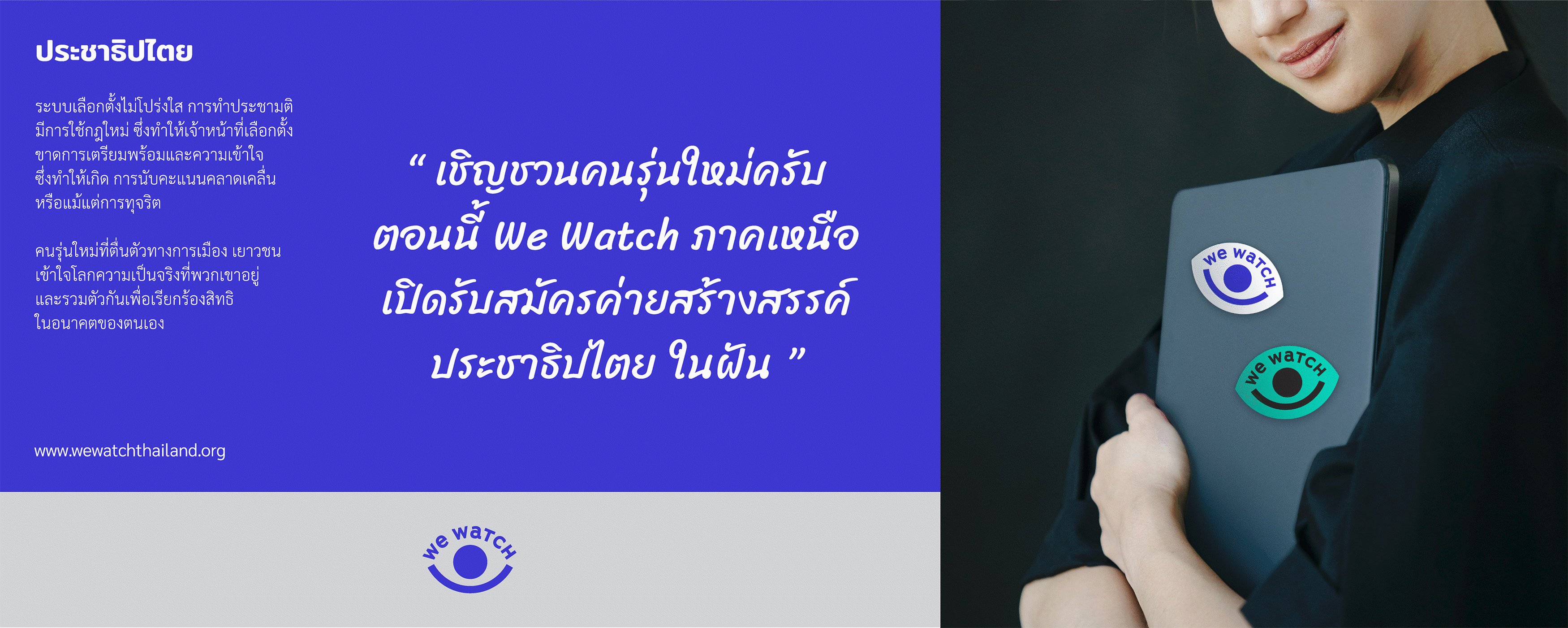
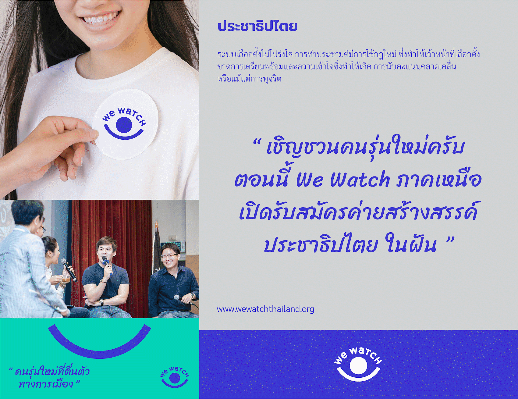
We Watch is a non-profit organisation that helps observe, monitor, supervise impartiality changes among political directions with transparency as well as provides knowledge and understanding to a new generation of youth with political awareness. It is also a political medium with the long-term goal of honestly supporting, developing, and protecting democracy.
Brand identity
design concept
The design concept reflects a brand that is adaptable, creative, friendly, and approachable. However, it also clearly demonstrates a point of impartiality and credibility. The design emphasises diversity in order to ensure the long-term brand extension, instills a sense of ownership in all members.
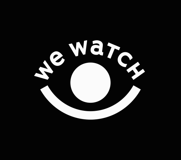
logo design
The logo is based on the brand name We Watch, inspired and incorporates design elements from the eyes to convey observation and care. The bracket symbols convey the meaning of the expansion or emphasis. The full stop symbol denotes the end of the sentence. Placing the brackets and full stop symbol in the opposite direction also symbolises generosity and friendliness.
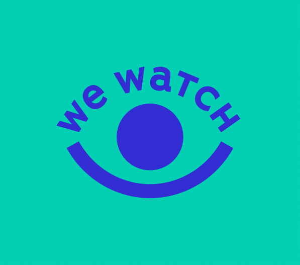
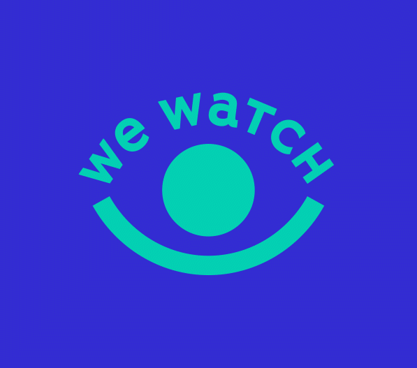
font & color design
Branded fonts are chosen to be legible. It is simple to use for people of all ages and is firm and honest. Brand colours are designed to appeal to the new generation. By using blue as the primary colour, it creates a distinct and creative atmosphere. Including emphasising the use of RGB colour values in various online media applications.
motion logo
The motion logo not only represents an eye watching and observing an event, but also a silhouette of a man with an embracing gesture on the We Watch brand name.
brand element
The bracket symbol is used in a variety of contexts, such as emphasising a quote, dividing a layout, and displaying a friendly smile. The full-stop symbol can also be adapted to a circular shape to create a unified brand image and identity on a different format.
clients
Article Group Organization (AGO)
https://articlegroup.org/about/
VIA :
credit
Design Director by Pongtorn Wachirapoka
Designed by : Praree Kittidumkerng , Wannaporn Bangsuanluang
Content Writer : Nithivadee Punyasiri
Translator : Juthamard Chawaleemaporn
Exclusive for Andon Design Daily Co.,Ltd.
Copyright © 2021 Andon Design Daily Co.,Ltd