CHIHABU
brand identity
| eat good healthy
| eat ten
| edtguide
| ezy home
E
| eat good healthy
| eat ten
| edtguide
| ezy home


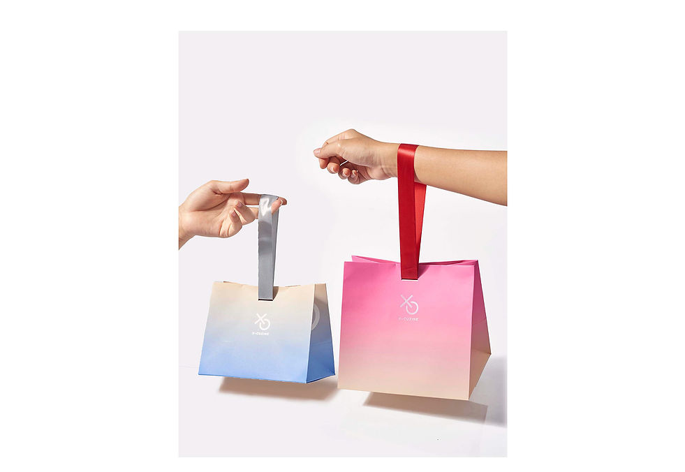
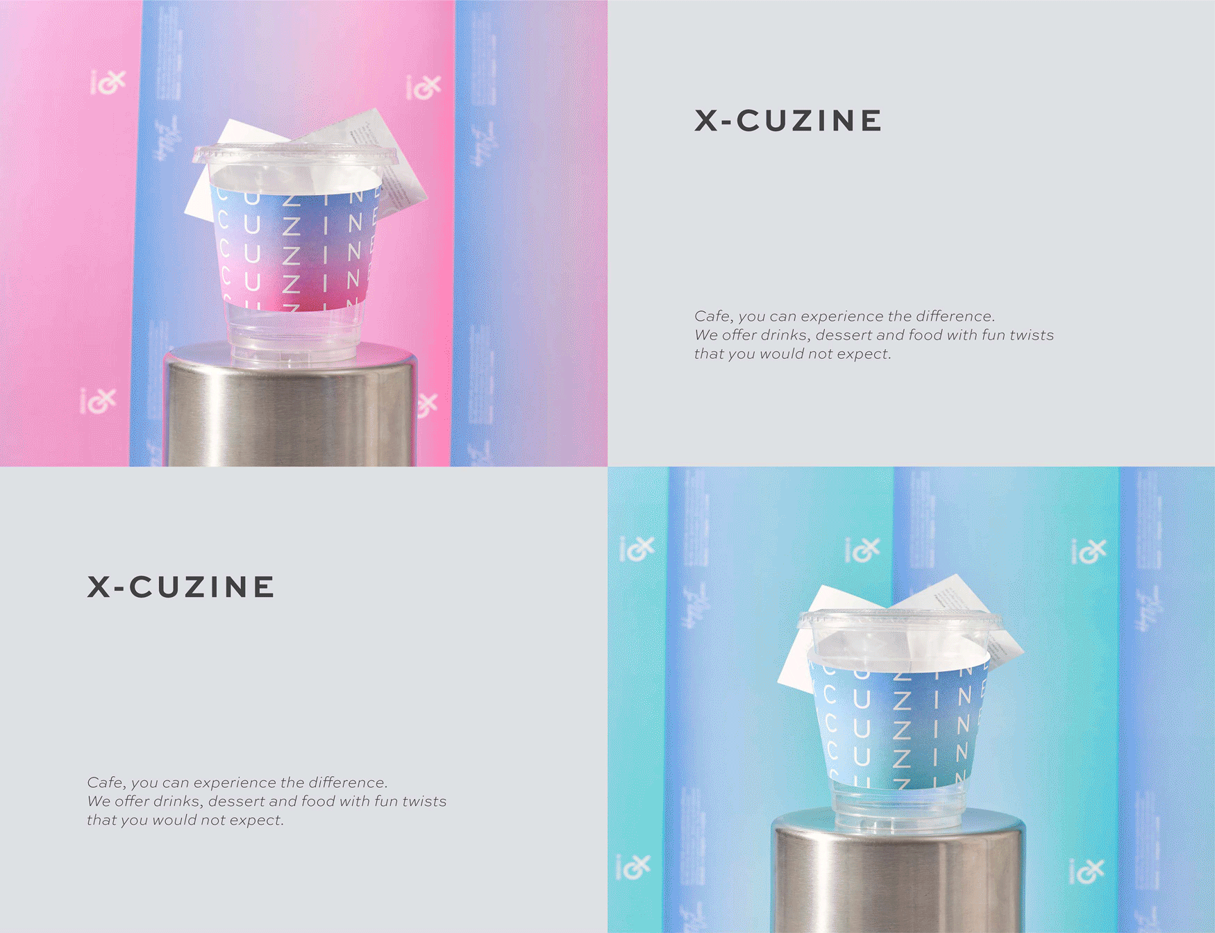
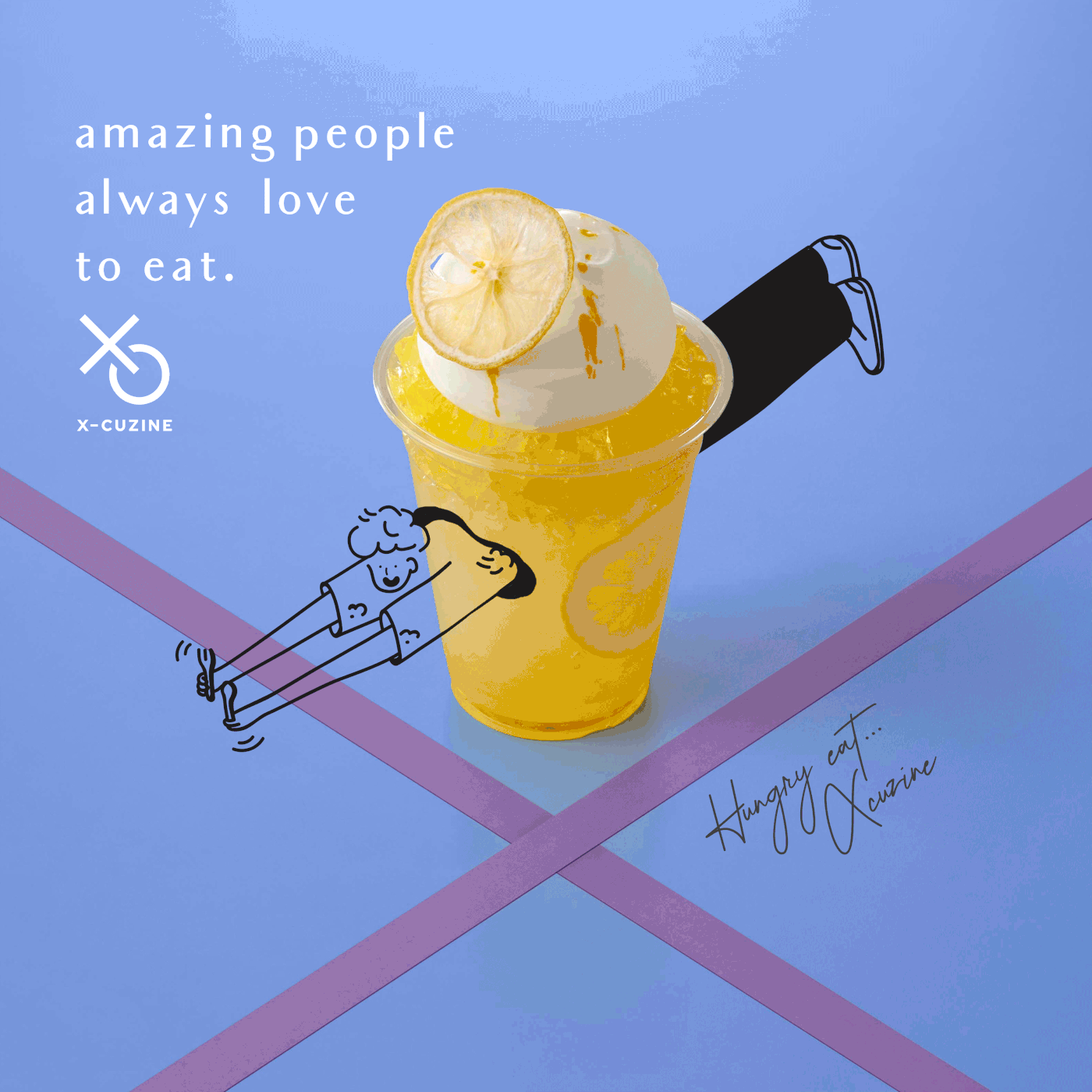
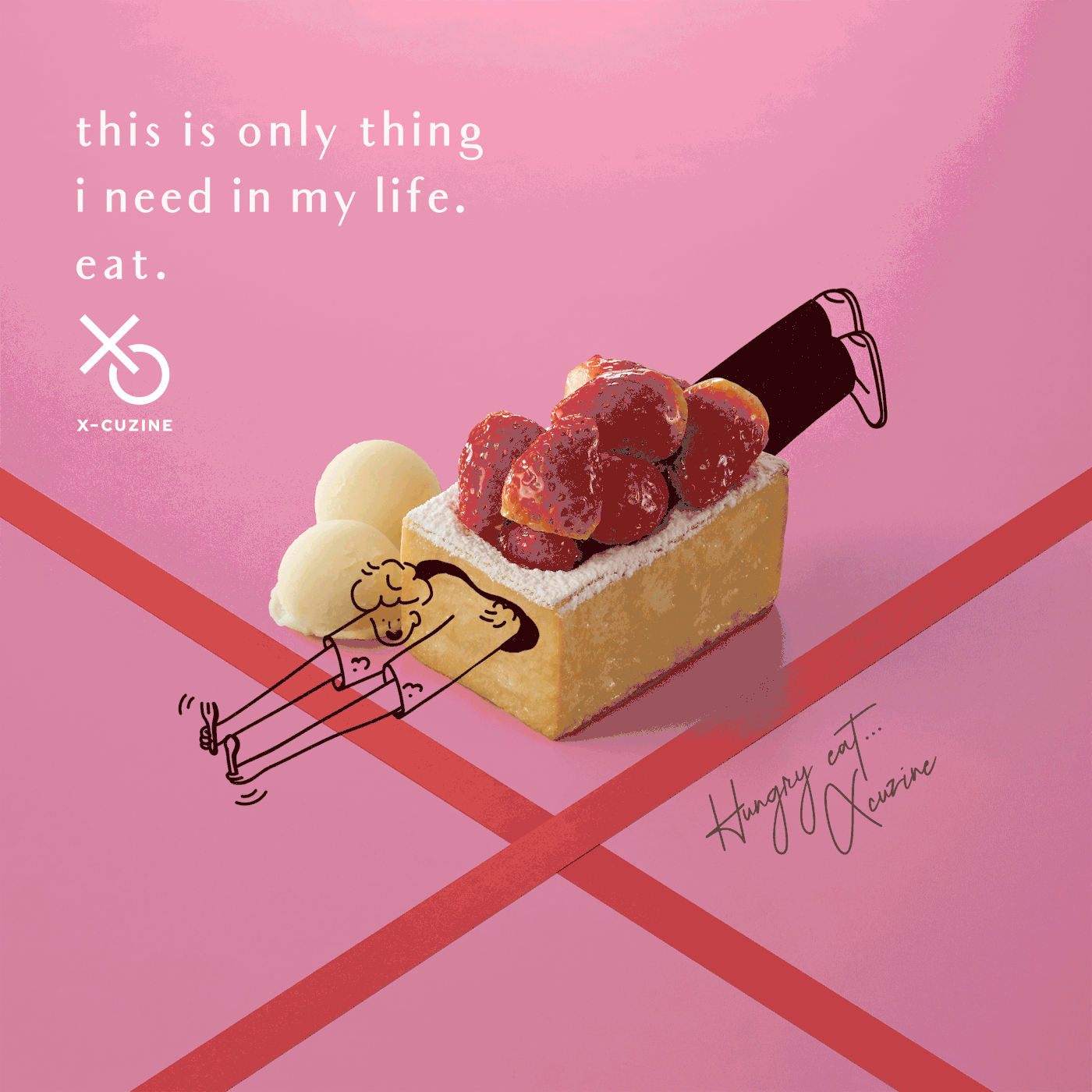
X-CUZINE
project synopsis
category
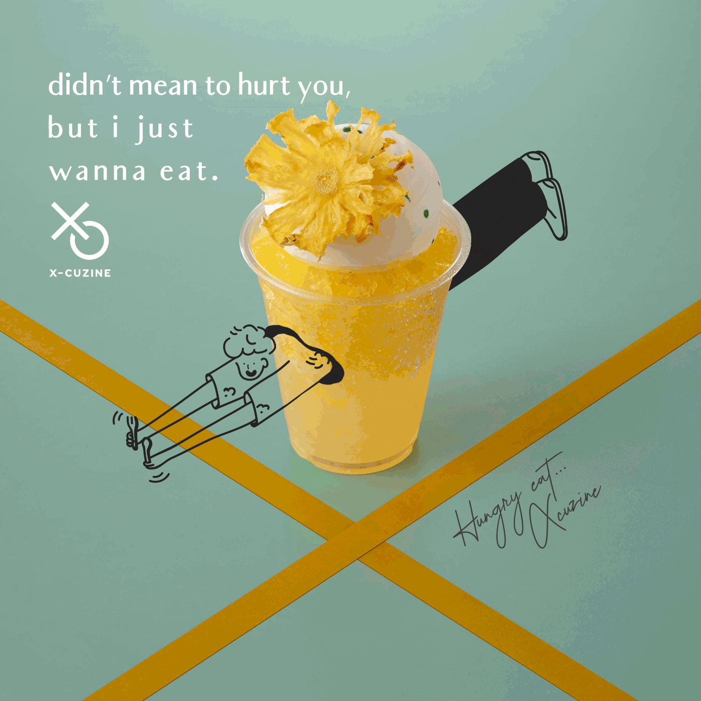
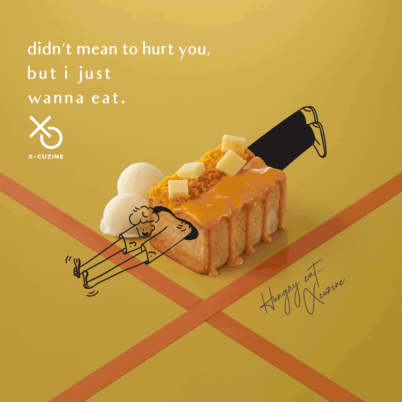
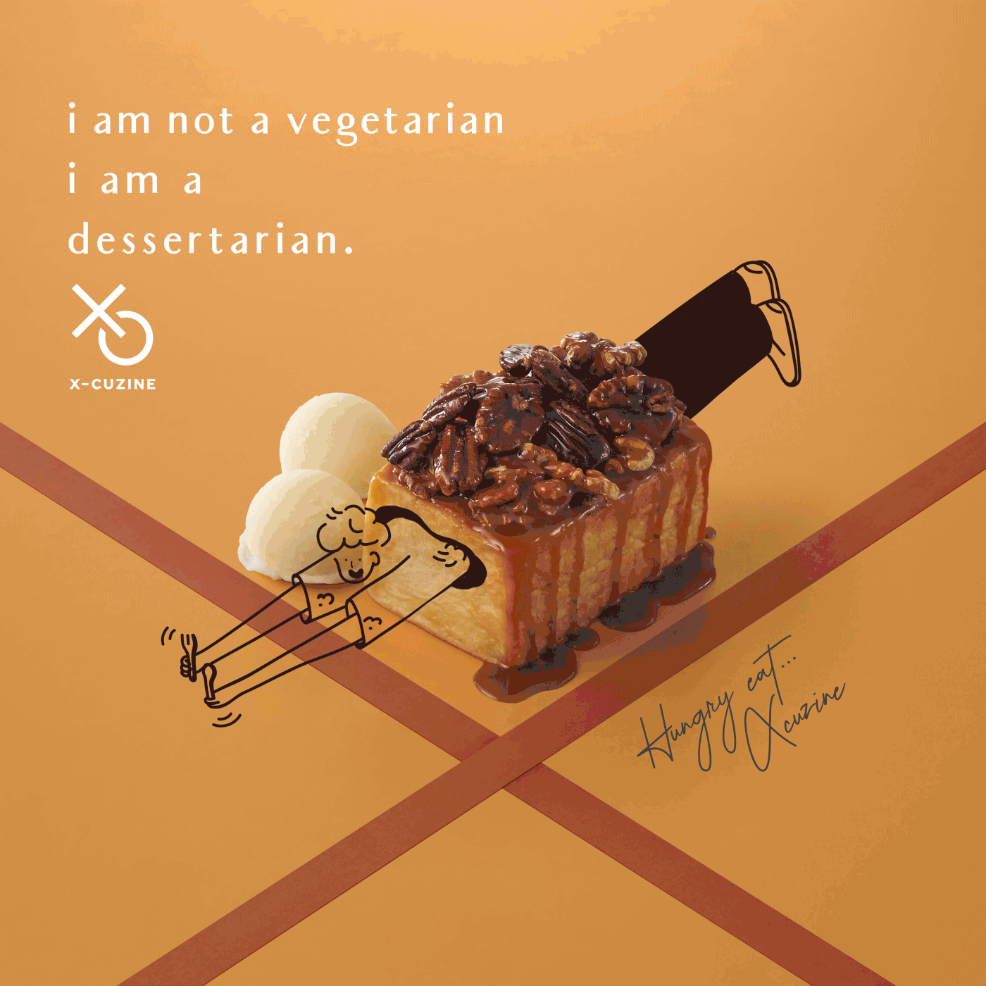
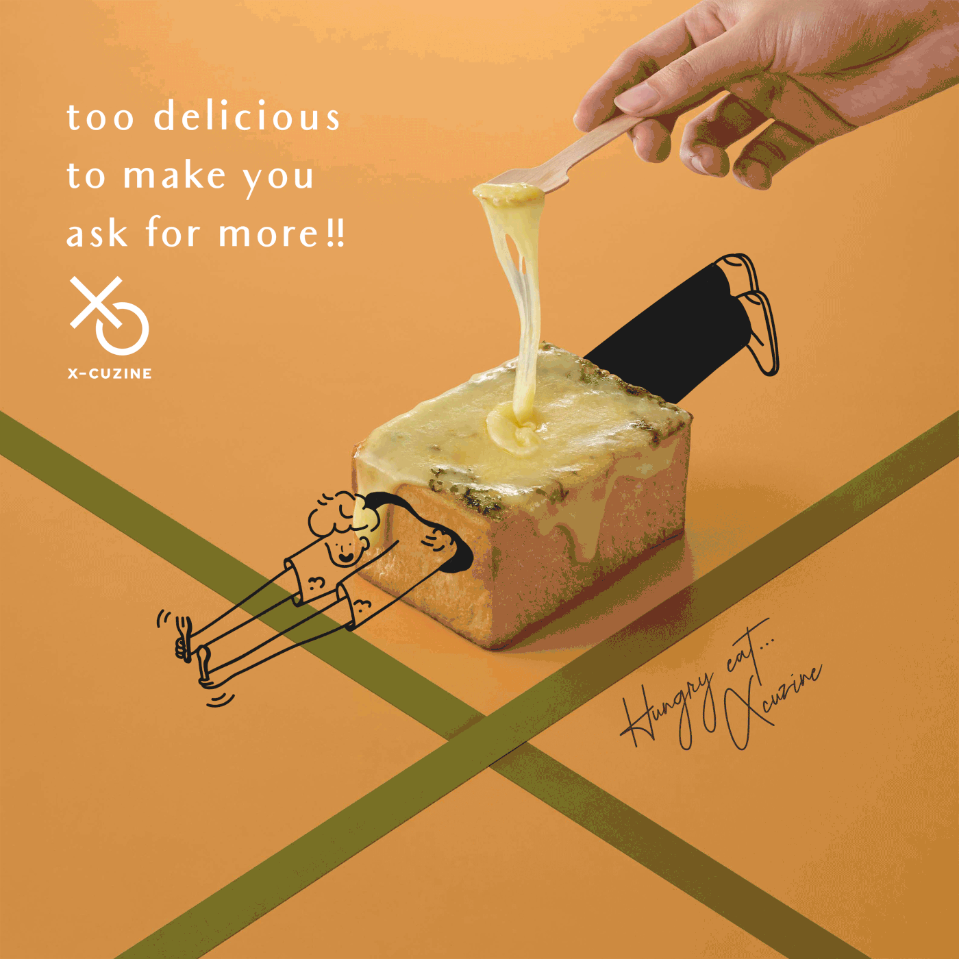
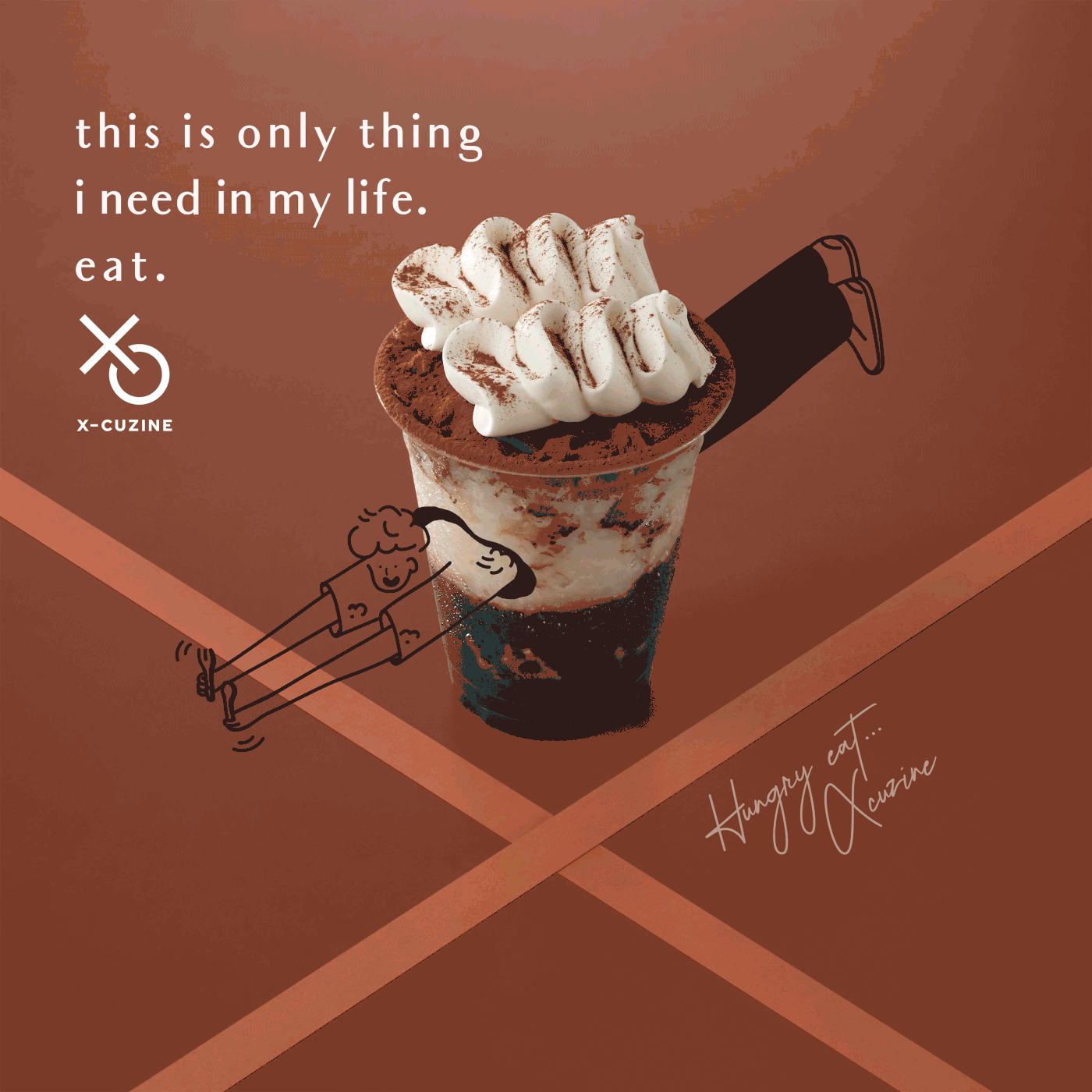
Always Hungry.
The cafe offers Drinks, Desserts, and Food. Created a special menu with unpredictable flavor that will make you never stop hunger.
Also, an ideal space for you to take beautiful pictures that invite people to come and create the whole new experiences.
logo concept :
The classic Tic-Tac-Toe game is an inspiration for X-Cuzine logo design. It gives a playful experience to players as same as X-Cuzine identity, and its graphic elements, X and O, were applied to the brand logo. The transformation of O to C shape communicates the process of new exploration. The name of the brand originates from the word 'exclusive' combining with 'seen,' a past participle of 'see' which means 'to perceive with eyes.' Additionally, Seen is the name of X-Cuzine mother brand.
brand stategy :
Brand strategy has approached from target customers characteristics then simplified to be a character design. The character appearance speaks about nowadays consumer behaviour such as a like-to-selfie person, a social media user, a photographer and, of course, a food lover, with a pleasant face reaction when they're getting through their desserts literally. These can also be applied to prints and an online platform to make the brand accessible to its targets.
Brand Identity
clients
credit
Design Director by Pongtorn Wachirapoka
Graphic Team :
- Natcha Dusadeepum
- Waratchaya Boonket
- Wannaporn Bangsuanluang
Interior designer by Pratthana Thaweema
Photographed by Parinya Kawsrito
Exclusive for Andon Design Daily Co.,Ltd.
Copyright © 2019 Andon Design Daily Co.,Ltd